A few years ago, when I was working in enrollment management, I spent a summer collecting admissions materials from across the country. My research was part intel gathering, part establishing a list of best practices — an endeavor I am sure many in the field have spent time doing.
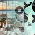
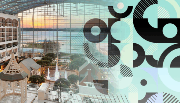
Among many of the email lists, pdfs and social ad screenshots I collected were a few bits of West Virginia University’s undergraduate recruitment materials. As I began to recreate their comms flow, I noticed an interesting phenomenon. Their web experience mirrored their recruitment materials (or the other way around). What I came to find — and ultimately become enamored with — was how purposeful each component of the recruitment experience seemed to be. The recurring pattern I found was that it all was anchored in a consistent and seamless web experience.
West Virginia University
What was central to much of their content strategy appeared to be built around career pathways. At the time (this was a few years ago), the pathways played a more dominant role; now, it appears to be a part of the academic experience. Either way, these are built with exploration and outcomes in mind, and all get to the heart of what students are seeking, even if students can’t quite figure out how it translates to a specific degree.

From micro interactions to frictionless UX, I am turning our attention from celebrating the creative found in higher education marketing campaigns to celebrating the web experiences both big and small. Despite the TikTok-replaces-Google clickbait headlines and the layers of technology higher ed marketers are adding to their marketing stack, an institution’s website is still the hub and still represents the pulse of the brand. It’s where prospective students research programs, ask questions, determine deadlines and, hopefully, apply. Whether it’s well-organized pages, clean designs, compelling micro interactions or brilliantly branded elements, below is a list of 9 other web experiences that work and should be celebrated.
Providence College
At its simplest, a brand is merely a shortcut heuristic to create a connection between the brand and an attribute or service. Websites act in a similar manner, reducing friction throughout exploration and making sense-making easy. Although there’s a lot to love about Providence’s home page allows a visitor’s ability to find a particular degree a seamless part of the user experience.

Thomas College
There’s just something about the subtle details found in the small expressions of a brand experience that help to breathe life into it. It’s the use of wooden signage in Whole Foods to signify “fresh.” It’s the subtle curves of an iPad. For websites, it’s the subtle microinteractions and design elements that can elevate the very brand codes marketers so desperately want to build. In the case of Thomas College, it’s the topographic patterns that tie the college to its environment – both its city and mountain surroundings.

Similarly, the footer’s design is slight, but it is a mighty nod to Maine’s scenic landscape.

Hampshire College
For every joke about college websites, whether it’s a website-by-committee jab or the front-page-for-faculty-only cut, there’s a website that obviously, painstakingly puts the very audience it serves at the center of the experience. Hampshire College’s website does just that. There’s no question what they offer or why that offer is unique. Moreover, they do so in an incredibly compelling way. Aside from the design and copy, the top-level navigation makes exploration easy and the hierarchy of information creates a sense of a story unfolding as the user scrolls down the page.

Messiah University
There’s something so pleasant about a perfectly designed program page. There’s plenty of examples of program pages that seem to be an amalgamation of different components, some copy pulled from the outcomes section of a student handbook and a quick nod to SEO. And although that’s not meant to be an indictment by any means, when you stumble upon a well thought out program page, it tends to stick out. In the case of Messiah University, there’s so much to celebrate. There are the small things: the icons, which make it easy to discern the degree type; the FAQs and student outcomes front and center; and the easy to complete three-field RFI. Then, there are the larger parts: the stylized menu and the “Programs related to” component at the bottom of the page. What I love most, is the faculty introduction (the small circle at the bottom left of the image). Users get a quick, informal message from a faculty member that creates a quick connection to an expert in their potential major – and my guess, the university.

Tulane University
Humans don’t like to exert much energy, especially when it comes to thinking. We can only handle so many stimuli in our everyday lives and daily tasks. The same can be said for our web experiences. Just as clutter affects our ability to retain and recall our advertising messages, cluttered pages, too many microinteractions and a lack of message hierarchy decrease the likelihood users will engage or complete the intended conversations.

Tulane University’s capital campaign landing page is a masterclass in well-organized and clean design. The page features easy-to-read typefaces, thoughtful approach to white or negative space and an excellent execution of page structure and message hierarchy. Users are able to move effortlessly from component to component without losing focus on what the page is designed to do, which is exploration of donation opportunities.
University of Pennsylvania

Another web experience of which I’ve been a bit envious over the years is UPenn’s admissions pages. The top-level experience of the admissions page through the academic experience and on to the student profiles that connect to areas of interest create a wonderful world for prospective students to explore. The pages have a compelling design and interesting microinteractions, and all the little brand bits incorporated throughout each page create a well-branded experience.

University of Maryland
What’s a good website without great copy? The youandumd.com microsite launched in conjunction with UM’s Brendan Iribe Center. The goal of the campaign was to build awareness and target C-suite decision makers to educate them on the prestige, quality students and the low cost of living in College Park so these leaders would consider starting business operations there.

University of Arizona
When it comes to transfer student recruitment, it seems that only recently have efforts to elevate their experiences become noteworthy. Although many institutions have gone to great lengths to make the process easy-to-navigate, I love what University of Arizona has done with their Transfer Credit Tool. The tool enables credit articulation to happen seamlessly, and without having to jump to a pdf or another part of the site. I also love that users can quickly find a link to an academic advisor or a transfer recruiter.

University of Virginia
I was originally going to discuss UVAToday — I love a good news site — but I managed to stumble upon Great and Good, a website devoted to UVA’s strategic plan. I adore the UX, the type and the spacing; it is perfect. The site is easy-to-navigate, and each key initiative includes supporting articles throughout but not to the extent that they overwhelm. My favorite part is the interactive timeline. What can often be a cumbersome or ill-designed component, is well-built and naturally takes the user throughout the strategic plan as it has evolved over time.

The proverbial cherries-on-top are the little ads placed on UVAToday (see below).


No matter the audience, it’s critical for an institution’s website to reflect and reinforce the brand, be well-designed and functional and have seamlessly created pathways for user exploration and information seeking. Visitors aren’t just evaluating an institution’s experience compared to other colleges and universities but evaluating its experience with companies outside of higher education. These examples show that thoughtful and well-designed web experiences can elevate a website and the brand.