Calls-To-Action: What They Are, Why You Need Them, And Why Yours Are Failing

Calls-to-action are an integral part of generating leads, and yet so many higher ed websites don’t have them. Here’s why you should.

10 minutes
By: Stephen App
featured-image

Back in graduate school, I was meeting with a potential advisor about my thesis. As I explained each aspect of my theory and the basis for my research, he kept responding with “so what?”

“I want to explore how professional sports teams use social media.”

“So what?”

“So I can better understand the value they’re providing to fans.”

“So what?”

“So they can learn what content resonates with fans and what doesn’t.”

“So what?”

This went on for nearly an hour, as my professor implored me to probe deeper into my idea and find better meaning and justification for my paper.

I left that meeting frustrated of course; I was younger back then, annoyed by the fact that my original, half-baked idea for a thesis wasn’t only not being approved without question, but wasn’t being met with a resounding round of applause.

As the years have passed since that encounter, however, I find myself repeating those words. So what?

Your social media post went viral. So what?

Your blog post is gaining web traffic month-over-month. So what?

Your article ranks on the first page of Google. So what?

The Value of a Call to Action

I don’t ask these questions to be a jerk. Rather, like my one time graduate professor, I’m prompting you to consider at a deeper level what the goal of your website is and if your small victories – like a well-ranking blog post – are actually helping you achieve those larger goals.

I often tell friends and colleagues that nobody decides to apply to a college or university because they read a particular news story, blog post, or any single web page on your article. The journey to choosing a school or college is long and arduous, and your content needs to guide prospective students along that path, one phase at a time.

And calls-to-action are how you do it.

What is a Call-to-Action?

A call-to-action, often referred to as a CTA, is a prompt, typically in the form of a button, designed to persuade a reader to take a particular action.

Your call-to-action is a signal to a web visitor, providing them direction and guiding their website experience. For example, after reading an article about your application requirements, a logical call-to-action might be to submit an application. Or after reading about important questions to ask campus tour guides, a relevant call-to-action would be to schedule a visit.

Do You Need a Call-To-Action on Your Website?

A good call-to-action guides a reader through the applicant journey, leading them to additional relevant information and keeping them engaged with your institution online. Over time, this engagement increases their propensity to take meaningful action with your school, whether that’s submitting an application or deposit, or for alumni, making a gift.

Without a call-to-action, your reader is left to self-navigate their website experience. And when left to their own devices, the odds that they’ll exit your website naturally increase.

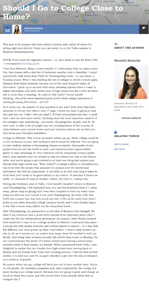
For example, let’s examine an excellent blog post published by the Tufts University Office of Undergraduate Admissions. This piece addresses a topic relevant to prospective students and is well-written, but there’s no call-to-action at the end of the article. So what is a reader to do?

Tufts University Admissions Blog Post - calls-to-action example
Notice how this Tufts University Admissions blog post doesn't feature a call-to-action.

When we don’t offer students with a clear path forward, we run the risk that they’ll choose to exit our site. And if that’s the choice they make, there’s no guarantee that they’ll come back.

So what could Tufts have done differently? On a blog post about going to college close to home, students may have been interested in seeing a student profile of a local current student. Or they might be interested in taking an interactive quiz after reading this article. Tufts could have included a registration prompt for an upcoming open house event. Or in the event that nothing was scheduled for the near future, a call-to-action to schedule a visit to campus.

How to Write a Call-to-Action that Delivers

Of course, inserting a call-to-action into your various web pages and blog posts doesn’t guarantee that anyone will actually click on them. In order to be effective, your call-to-action needs to be compelling and relevant to your website user. But at a more basic level, it needs to be prominent, and it needs to be explicit in its directive. If you deploy CTAs on your website, but find your conversion rate is subpar, chances are you’re making a mistake in one of these three key areas.

Mistake #1: Your CTA Isn’t Visible

If readers don’t see your call-to-action, they’re not going to click on it. That may sound like elementary advice, but .edus are loaded with barely-visible calls-to-action in the form of plain text hyperlinks and monotone colors.

Why does your cta need to be visible? 55% of website visitors read blog posts for less than 15 seconds. Many of these readers are skimming your content, searching for headings, images, and key phrases that may signal to them that the page they’re visiting is worth their time.

For content skimmers, a plain text or hyperlinked call-to-action is likely to be skimmed over in search of more eye-catching content. To get users to recognize your call-to-action, your CTA needs to be one of those eye-catching assets. And often times, that requires the use of a call-to-action button.

Sidebar CTAs - calls-to-action example
Each of these articles contains a CTA, but one of them is easy to miss, while the other catches your attention immediately.

Take a look at the two articles above. Each of them contains a call-to-action in the sidebar, but one is easy to miss, while the other immediately catches your attention. In the example at the left, the call-to-action is written in bold, but the hyperlink isn’t, and it’s the same color as the rest of the text. If you’re skimming an article, you’re much more likely to glance at the Twitter module below the call-to-action.

In the example on the right, however, the call-to-action is in the form of a button, which features a bright red color that immediately stands out against the white page background. It doesn’t take 15 seconds to see that prompt and consider taking action.

Tips for Crafting a Visible Call-to-Action

  • Use buttons whenever possible
  • Choose a contrasting color that pops against your background
  • Avoid plain text
  • Use short, simple language that’s easily skimmed

Mistake #2: Your CTA Isn’t Explicit

In higher education, four calls-to-action reign supreme across the .edu landscape:

  • Visit
  • Apply
  • Request Information
  • Give

These calls-to-action are not without merit. In fact, each call-to-action example above plays a valuable role in the sales funnel for higher education administrators. Editor’s note: we’ll be covering the main issue with the Request Information call-to-action and landing page in the coming weeks.

The issue crops up when we apply the format of these commonly-used CTAs to other offers and call-to-action buttons. My colleague Angela Sanders briefly touched on call-to-action best practices in a recent blog post, but as a reminder, your CTAs should begin with an “action” verb followed by specific keywords that describe your offer.

I like to say that your call-to-action should make sense if it was taken completely out of context. For example, in the examples below, you can see the difference in CTA button language. In the example below on the left, the language is generic. “Click here” doesn’t offer students any compelling reason to click on the button nor does it tell students what to expect upon doing so. The example below on the right, however, is action-oriented and much more explicit, and offers students a clear direction as to what is going to happen when they click on the button — in this case, subscribe to emails.

CTA Buttons - calls-to-action example
The example on the left is too generic. The example on the right is action-oriented and much more explicit.

Now, you may be thinking, ‘yes, but doesn’t the language above the call-to-action button clearly communicate what students will do when they click the button?’ And to answer your question, yes it will. But do you want to rely on that? Remember, students skim your content, and while a call-to-action box may catch their attention, that does not necessarily mean they will take the time to read the contextual information above it.

Explicit calls-to-action don’t just apply to your content offers, however. Your website is likely full of call-to-action buttons, all created for the singular purpose of guiding students on a learning journey. Here too, explicit and compelling copy is key.

Olivet Nazarene University, near Chicago, does a great job with this. On their academics page, shown below on the left, notice that their CTA language, “Find my Interest”, is explicit and compelling.

Now compare that call-to-action to another academics page from a similar college on the right. Which call-to-action is more compelling to you?

Olivet Nazarene University offers a great CTA example. However, the example on the right leaves students wanting clarity before they click.

These are subtle differences, but when you consider that these pages receive thousands of pageviews a year, even a subtle shift can make a massive impact on your website engagement and lead generation efforts.

Tips for Crafting an Explicit Call-to-Action

  • Use action verbs
  • Avoid generic language, such as ‘read more’ or ‘click here.’’
  • Treat your CTA as a verbal contract with your user

Mistake #3: Your CTA Doesn’t Match Your Content

Despite your best efforts, hopes, and dreams, students don’t commit to your institution, or even to the idea of applying to your institution, during a single visit to your website. Rather, as I’ve written about in the past, students progress through a journey, during which their needs and goals gradually shift.

There are three stages of the applicant journey:

  • The awareness stage, where prospective students are focused on problems; ie: can I get an MBA without quitting my job?
  • The consideration stage, where prospective students are focused on solutions; ie: what schools near me offer part-time MBA programs?
  • The decision stage, where prospective students are focused on products; ie: what is the tuition for State University’s Evening & Weekend MBA program?

While forward-thinking schools are beginning to create content for each stage of the applicant journey, these same schools have been slower to diversify their library of calls-to-action, limiting their ability to guide top-funnel or early-stage students through their website.

This result often occurs when marketers fail to think like a consumer. We rarely make an offer on the first house we visit or buy the first car we test drive. Choosing a college is a similarly large investment. Why are you expecting your prospective students to apply after reading an awareness level blog post?

Related: How can you tell what applicant phase your students are in and deliver them personalized content? eCity Interactive’s Content Marketing Specialist Melissa Bischoff has the answer.

In many ways, failing to accurately map your calls-to-action to the appropriate applicant journey phase can override the first two mistakes. Your call-to-action can be visible and compelling, but if the CTA doesn’t match the applicant phase of the student reading your content, it’s not going to be relevant and it’s not going to be clicked.

Creating relevant calls-to-action for each phase of the applicant journey isn’t difficult. The key is mapping the commitment of your CTA to the applicant phase of your students.

  • In the awareness phase, prospective students are on the hunt for value-based, educational content that addresses their pain points and questions. Rather than prompting them to apply, ask them to sign up for your email list, follow you on social media, or download an eBook.
  • In the consideration phase, prospective students are focused on solutions, but not necessarily ready to commit to your solution in particular. This is the time to deploy calls-to-action to connect with a member of your admissions team, read an alumni success story, attend an open house event, or, for shorter certificate programs, start an application.
  • In the decision stage, prospective students are actively evaluating their options. Now is the time to prompt students to submit an application, schedule a campus visit, or send in their deposit.
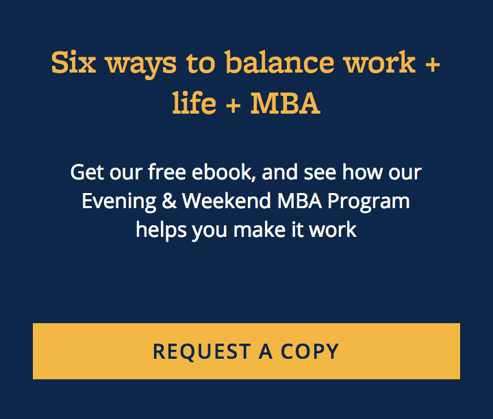
Haas School of Management Call to Action - calls-to-action example
This eBook download is an excellent way to generate prospective student leads higher in the admissions funnel.

Consider the above example from the Haas School of Management at UC Berkeley. Rather than ask students to apply to their program, or even visit campus, they are generating prospective student leads higher in the admissions funnel through an educational eBook that addresses a key challenge — getting an advanced degree while working and raising a family — that students interested in their Evening & Weekend MBA program are facing.

The students who download this piece may not be ready to commit to Haas’ Evening & Weekend program, but by providing value to these students, and collecting their contact information, the Haas admissions team can now nurture those students through subsequent stages of the applicant journey until they ultimately reach a decision about applying or enrolling.

Of course, your prospective students don’t exactly tell you what stage of the applicant journey they’re in — that would make creating contextually relevant calls-to-action a whole lot easier. And short of a blog or microsite built within a marketing automation platform, you likely don’t have the data required to identify those phases.

The good news is that you don’t necessarily need to. If you aren’t sure what phase of the applicant journey website visitors are likely to be in, consider the context and tone of a particular webpage and work backwards.

  • If your webpage contains high-level content that addresses an audience pain point but doesn’t overtly promote your particular institution, classify it as awareness-level content.
  • If your webpage contains key program or product details, such as tuition, admission deadlines, curriculum, and financial aid, classify it as consideration-level content.
  • If your webpage contains differentiating factors about a particular program or major, such as career outcomes and student testimonials, classify it as decision-stage content.

Another way to provide contextually-relevant calls-to-action is to match your CTA to seasonal cues. For example, if a particular graduate program begins every August and January, you might consider swapping out awareness-stage calls-to-action for decision-stage calls-to-action each July and December, since students browsing pages in the weeks leading up to admissions deadlines may be more likely to respond to an application prompt.

Tips for Crafting a Contextually Relevant Call-to-Action

  • Create at least one call-to-action for each applicant phase
  • Track CTA performance and optimize or replace as necessary
  • Host your blog and calls-to-action on a marketing automation platform, enabling smart CTAs
  • No marketing automation platform? Adapt your CTAs based on seasonality and enrollment timelines

Your .edu likely sees tens or hundreds of thousands of pageviews a month. Are you getting the most value out of that traffic? Calls-to-action provide direction to web visitors by leading them to additional relevant information and keeping them engaged with your website. Without them, readers are left to their own devices after completing the task that originally brought them to your website. And when left to their own devices, too often that next task is going to take place on a website other than your own.

But calls-to-action, by default, are not enough. In order to be effective, your calls-to-action need to be prominent, explicit, compelling, and relevant to your web visitors.

Deploy buttons whenever possible, and use a button color that pops against your background. Use short, action-oriented language, and make sure that your call-to-action or content offer is contextually relevant to your content and your user.

Your prospective students are on an educational decision journey, and your website remains the single most influential map. Does your .edu offer pinpoint directions? If not, consider this my call-to-action.

Want to receive updates on the latest in higher education, design, and development? Sign up for our monthly newsletter.

Stephen App

Stephen App

Stephen App helped pioneer the content marketing strategy at eCity Interactive, Volt’s parent company. He launched the Hashtag Higher Ed podcast (now called Higher Voltage), and built a unique community of higher ed leaders that has continued to flourish. Today he is working in new pastures at CampusSonar, and you can connect with him on Twitter @StephenApp.


Newsletter Sign up!

Stay current in digital strategy, brand amplification, design thinking and more.