Your landing page has one goal: to convert. That’s it. Fin. Full stop. Of course, there are several different components to a landing page, but each one exists with the sole purpose of increasing the percentage of page visitors who fill out an information form and click submit. Or at least they’re supposed to. Higher education is littered with examples of landing pages gone awry. That’s likely why higher education has the lowest landing page conversion rate, 2.6%, among industries tracked by unbounce.org.
Landing Pages: What they are, why you need them, and best practices for conversion
If your landing pages are underperforming, you’re likely including one of these three key mistakes. Read on to learn what they are and how you can fix them.

What is a Landing Page?
If we’re going to talk about how to optimize landing pages, let’s start by clarifying what we mean by “landing page.” Now I love me some Google Analytics, but in this case, GA can actually cause confusion here. In Google Analytics, a landing page is the first page that a web visitor lands on when they come to your website. Take a look at your most popular landing pages in GA, and you’re almost certainly going to see the homepage, represented as “/”, at the top of the list, followed closely by your main admissions page. While there’s certainly value in knowing what pages your visitors are coming to, that’s not what we’re talking about here. Rather, when we discuss landing pages in this article, we’re referring to pages that are created for the primary or exclusive goal of converting web visitors into leads.
Elements of a Landing Page
At a minimum, your landing page should have the following items:
- An Offer: this might be a sample course for an online program, an information packet from an admissions office, an email subscription offer from a central marketing communications team, etc.
- Value Proposition: your landing page should clearly communicate why a user should complete and submit an inquiry form and provide you with their email address. Request for Information (RFI) pages are notorious for ignoring this important component.
- A Form: this should be obvious, but it’s pretty hard to generate a website lead if we don’t have a mechanism for collecting contact information.
Beyond the basics, high converting landing pages frequently contain the following info:
- Imagery: high-quality photography can make a massive difference in the amount of information your users retain from your landing page. Consider, when people hear information, they’re likely to remember about 10% of that information three days later. But, if a relevant image is paired with that same information, people retain 65% of the information three days later. I’m no math expert, but last time I checked, 65% is higher than 10%.
- Social Proof: social proof is an invaluable extension of the value proposition I mentioned earlier. In America, the general level of public trust plummeted in 2018, according to a global 2018 report by Edelman. And yet, studies show that we regularly trust people who look like us. The takeaway: the more you can put a face on your landing page with a positive testimonial, the better your conversion rate will be.
- An Offer: your landing page should be tied to a means for delivering your offer. Ideally, this should take the form of a “thank you page,” but if you want to make your prospects angry, you can also do this through an automated email or worse, direct mail.
Do I really need a landing page?
The short answer: yes. Of course, if you’ve read any of my previous articles, you know I don’t exactly excel at short answers. Buckle in; this is going to be a #longread. Landing pages are a key mechanism for converting your anonymous web visitors into prospective students. Without them, you’re seriously damaging your website conversion rate. The appeal of a landing page is that it puts the opportunity for conversion — the web form — front and center for the user. Without a landing page, you’re likely relying on a web form to capture a user’s attention amongst a number of other information blocks. In other words, you’re burying the lede. (I’ll see myself out.) Is that really a big deal? You bet it is. 55% of website visitors look at your content for 15 seconds or less. So if your inquiry form isn’t prominent, your audience isn’t likely to stick around long enough to find it. You can see an example of this with Mercy College.
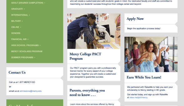
Without a dedicated landing page, Mercy is placing their Request for Information (RFI) Form below the fold of the web page, or below the area of the web page immediately visible to visitors. Worse, it’s mixed in with competing prompts, like their PCAT program, their partnership with RaiseMe, and admissions requirements, among others. There’s simply too much competition for attention. In the Mercy College example, the issue occurs because Mercy doesn’t have a dedicated Request Information Page. But that’s not the only instance where opportunities are left on the table. This also frequently happens when enrollment is run through an online program manager partner, or OPM.
Let’s take a look at another school, Massachusetts Institute of Technology (MIT). MIT offers a suite of executive education programs through a partner, GetSmarter. Now, there’s no problem with running programs through an OPM. But when schools partner with an OPM, they frequently run into an issue with landing pages. Here, you’ll notice that the MIT Digital Marketing Analytics course landing page is missing a crucial element of a high-performing landing page: the inquiry form.
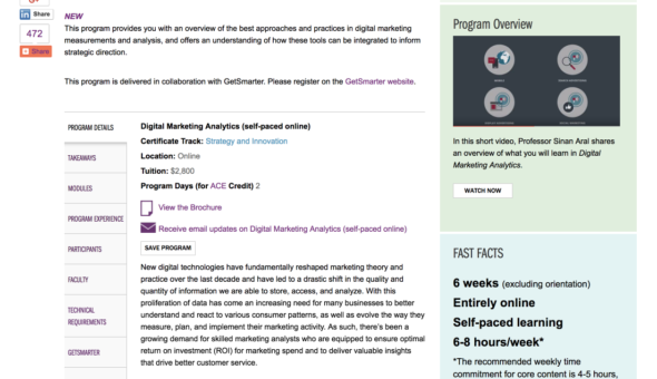
Indeed, interested students need to visit the GetSmarter website to register for this course. The MIT landing page simply contains relevant information about the course. Why doesn’t this work? For starters, you never want to put an additional step between where a user is and where they need to go in order to register for or learn more about a course. That’s especially true when your registration involves a third-party, which could raise red flags for a segment of your prospective students. MIT could have avoided this situation by embedding an inquiry form, perhaps supplied by their education provider, right on the course landing page.
Three Common Landing Page Mistakes (And How to Fix Them)
Of course, the simple act of creating a landing page is, in and of itself, not a recipe for lead generation. A landing page may seem like a simple page template, but focusing on simplicity is complex. And you don’t want to just build a landing page; you want to build a high converting landing page. If your landing page isn’t delivering the results you want, you’re likely making one or all of the following mistakes:
- Too many form fields
- Missing value proposition
- Competing content and links
Mistake 1: The Police Interrogation (Too Many Form Fields)
Here are two fun statistics for you:
- The average number of form fields is 11. Reducing that number to four can increase conversions by 120%.
- 50% of high school seniors and 41% of high school juniors have abandoned a form because of how much information was required.
Your form should feel like a dinner party conversation, not a police interrogation. That is, your form should request a few easy questions and then move on to the next user, rather than hounding visitors for more and more information. Students are turned off if you ask for too much information. As a general rule of thumb, you shouldn’t ask for any information you don’t need to keep communicating with them. Undergraduate RFI forms are, of course, the biggest culprit here. Gwynedd Mercy University features 19 form fields on their undergraduate RFI form, 17 of which are required. Bates College nearly doubles that, with an astounding 30 form fields, 13 of which are required. Does Bates College really need to know my school’s CEEB code or middle name to communicate with me? Doubtful. It doesn’t have to be this way. Finlandia University only requires three questions on their RFI forms, one of which gives students the choice in how they want to be communicated with.
The concern with short forms is often a lack of data. But it’s important to remember that there will be future opportunities to engage students. That might be accomplished through progressive form fields, meaning that as students fill out additional forms, they are asked new information, or through email nurturing. Once invested in your institution, students are much more likely to fill out additional forms if it means they’ll receive more personalized content moving forward.
Mistake 2: The Form Desert (Missing Value Proposition)
A missing value proposition is often the result of being too close to your topic. RFI forms are, again, the main culprit here. Visit the Bates College and Gwynedd Mercy examples referenced above and you’ll notice pages that are one-sided, with plenty of data being requested by schools but little to no insight into why students should supply that data. This occurs because, as an admissions or enrollment marketing professional, you inherently know what prospective students will receive when they fill out an RFI form. But do your prospective students know? Are you examining your landing page from their perspective?
A landing page may seem like a simple page template, but focusing on simplicity is complex. And you don’t want to just build a landing page; you want to build a high converting landing page.
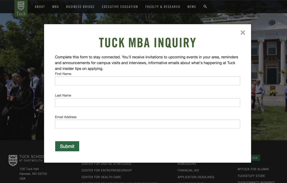
Just because a user lands on your landing page, you shouldn’t assume that they’ll fill out your embedded inquiry form. As contact forms become more prevalent and email inboxes get clogged, students are rightfully getting more careful about who to provide their contact information to. A value proposition addresses this concern by succinctly stating what students will receive in exchange for completing a form. Your value proposition doesn’t have to be long. Dartmouth’s Tuck School of Business features a short value proposition in their RFI pop-up module, which tells students that in exchange for their email address, they’ll receive, “invitations to upcoming events in your area, reminders and announcements for campus visits and interviews, informative emails about what’s happening at Tuck and insider tips on applying.”
Eastern Washington University keeps it a bit more vague, but still offers context by explaining to prospective students that they are specifically joining an email list, followed by a short blurb that explains what that list entails. In this case, “You’ll receive helpful, non-spammy reminder emails for important events and deadlines.” Short descriptions work well for RFI forms, because we can safely assume that students who navigate to this page are a bit further down the admissions funnel than other students. For graduate and certificate programs though, the value proposition needs to be more robust. UC Davis does a great job with demonstrating value on their Winemaking Certificate Program landing page.
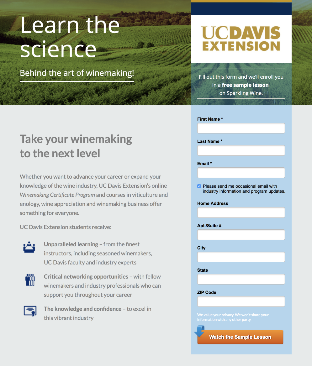
There’s a lot to like about this landing page. The headings are compelling, the form is short — only three required form fields — and the value proposition is clearly defined in three bullet points. Equally important, UC Davis is offering something of value — a sample lesson on sparkling wine — in exchange for filling out the form.
Mistake 3: Exit Stage Left (Competing Content and Links)
Competing links and navigation items on landing pages are perhaps the most common landing page mistake in higher education. This error sometimes occurs due to technical limitations of a CMS, but it can also manifest because of the perception that menu navigation and links to information help a student dig deeper into a site and stay engaged. That desire would be commendable in most circumstances, but remember, your landing page isn’t about engagement; it’s about conversions. When you view your landing page through a conversion lens, you stop seeing links as engagement opportunities and start seeing them as distractions. Again, your landing page has a single goal, which is getting users to fill out your contact form. With each competing link, you’re sending students away from that form with no guarantee that they’ll return. You can see an example of this from the UC Berkeley Haas School of Management’s full-time MBA program landing page.
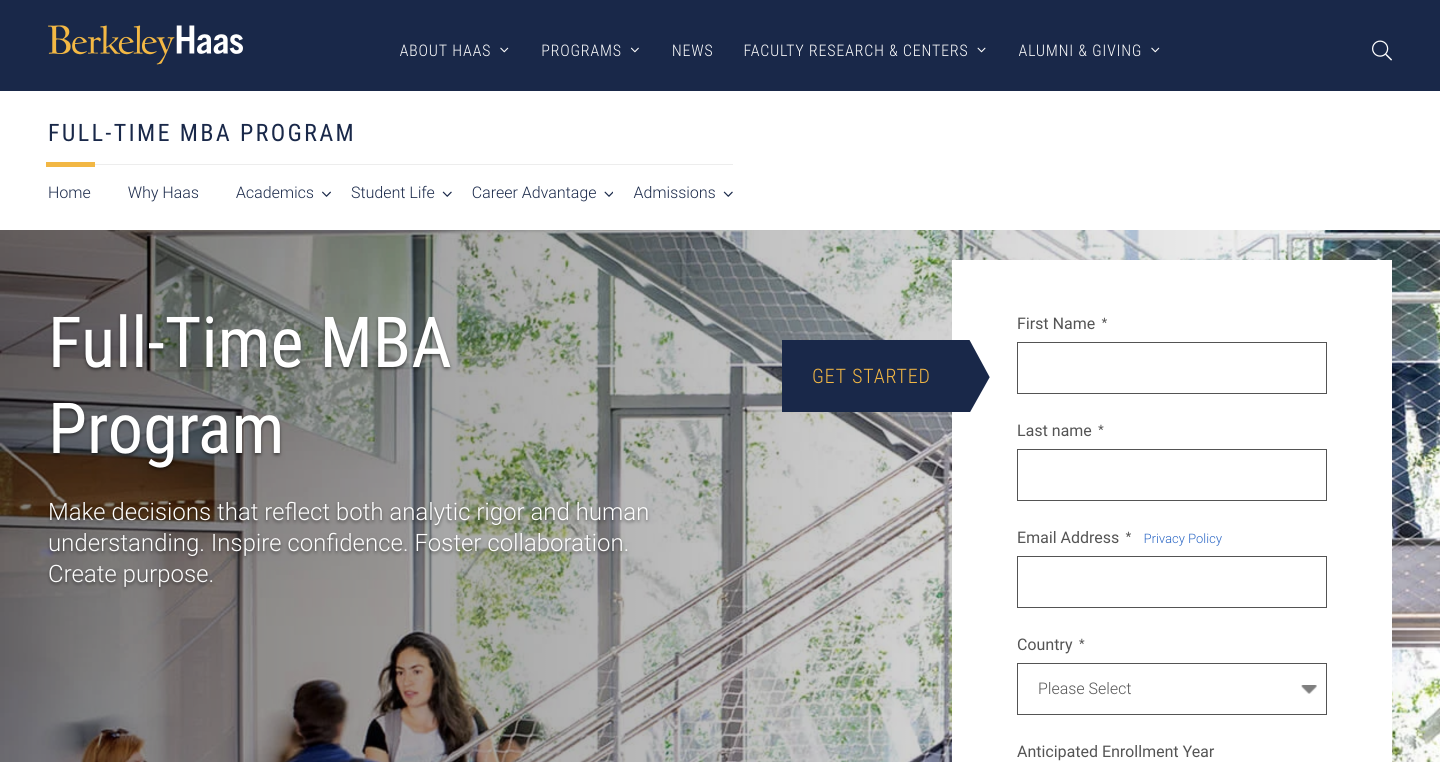
In totality, there is a ton to love about this page. It has a clear inquiry form that’s above the fold, a short and compelling value proposition, and snackable statistics that demonstrate the quality of the program.
When you view your landing page through a conversion lens, you stop seeing links as engagement opportunities and start seeing them as distractions
But it’s also full of competing links that pull prospective students away from the purpose of the page. Those links exist in the global navigation menu of the page, located at the top of the page, as well as the subset of links on the white color bar above the form. Scroll down the page, and you’ll see additional links and calls-to-action to explore student life, learn about academics and careers, and view upcoming admissions events. You can see an alternative approach from Thomas More University. Their global navigation menu has been replaced with a simplified menu — one that includes a logo for the school and a phone number to learn more.
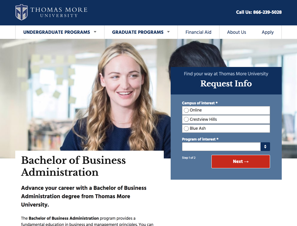
Below the global header, it appears at first glance that this landing page possesses a wide range of exit links. But in actuality, each link under “undergraduate programs” and “graduate programs” links to another program landing page that uses the same page template. Scroll down the landing page, and you’ll notice that Thomas More includes ample program information in the form of videos, rankings, outcomes statistics, and more, interspersed with repeated calls-to-action to request information or call admissions. While you can find exit links, often in the form of source links for statistics, they are given minimal real estate on the page, with preference given to calls-to-action that link back to conversion opportunities.
Your landing page has one goal: convert. Full stop. That seems simple in theory, but across higher education (and beyond), there are examples of landing page designs that make accomplishing that goal harder than it needs to be. If your landing page isn’t delivering the results you want, you’re likely including too many form fields, failing to offer a compelling value proposition, or including too many competing links and calls-to-action. But there is reason for optimism. As the examples above show, there are plenty of schools getting it right. Follow their lead (nailed it) and watch the results come in.

Newsletter Sign up!
Stay current in digital strategy, brand amplification, design thinking and more.