In an era when colleges and universities are grappling with declining enrollment, skepticism about the value of higher education, and heightened scrutiny of federal research grants, a college website is more than just marketing. It’s a strategic investment in an institution’s relevance and impact.
A 2023 study by Modern Campus found that 93% of high school students used college websites in their search, and 87% found them helpful. But they also reported they were turned off by poor UX design, hard-to-use navigation, and unclear admissions information. That’s a lost opportunity.
To be effective, higher ed websites must not only look good, engage audiences with strong messaging, and reinforce the school’s brand identity, they must also excel at functionality, intuitive design, and compelling content tailored to diverse audiences—from prospective students to alumni.
This list spotlights 10 standout college and university websites that set the bar for design, user experience, and storytelling. Whether you’re a digital marketer, designer, or higher ed communications leader, these sites offer plenty of inspo for creating a web presence that’s cohesive, compelling, and click-worthy.
Johns Hopkins University
Website: https://www.jhu.edu/
Founded in 1876 as the nation’s first research university, Johns Hopkins puts its scientific mission front and center. A microsite, Research Saves Lives, showcases dynamic storytelling around the school’s achievements in research and their impact on society and the economy. It’s both a strong brand statement and a strident defense of research funding. But it’s not all science. The site also spotlights narratives around the people—students, faculty, and alumni—who make up the school’s community, along with colorful photography and video that build narratives about life on campus and around Baltimore.

Marquette
Website: https://www.marquette.edu/
Redesigned in 2024, Marquette’s website leads with full-bleed photography that drops you right into the school’s Milwaukee surroundings. With bold statements like “Explore your purpose,” “Become your potential,” and “Be a part of something greater,” Marquette’s aspirational messaging reinforces the school’s tagline, “Be the Difference.” A page on the lasting value of a Marquette education backs up the sloganeering by making a strong case for the school’s value proposition, emphasizing tangible results (ROI) and how its Jesuit mission shapes its uplifting ethos. In 2023, the school won a CASE award for its Choose Your Major Quiz. When I took it, my results ranged from international relations to criminology and sociology—pretty accurate for someone who majored in political science.

Massachusetts Institute of Technology (MIT)
Website: https://www.mit.edu/
MIT’s understated homepage is a fitting extension of the school’s smart, cerebral, and hard-working identity (the school’s motto, after all, is “mens et manus,” or “mind and hand”). A simple, intuitive menu offers pathways for distinct audiences (prospective students, parents, alumni), and its admissions microsite features a close-up and personal view of campus life with an up-to-the-minute blog by students and faculty that gives prospective students a very personal window into the MIT community (and a chance to jump in and interact in the comments).

Michigan
Website: https://umich.edu/
Go Blue! Michigan’s rallying cry doubles as a design imperative as the site leans big into the school’s signature color. The site takes a maximalist approach, apropos given the school’s massive enrollment of more than 52,000 students at its three campuses. And yet, the design manages not to feel cluttered, with clear navigation filtered by audience. Prominence is given to Michigan’s research prowess and public impact, balanced by features like “Carpe Diem,” an engaging collage of timestamped photos that capture all the gongs on in a day in the life on campus.

Minerva University
Website: https://www.minerva.edu/
Minerva’s modern, vibrant, and dynamic website mirrors its unconventional educational model. Ranked as the most innovative university in the world, Minerva sends students on a global journey from San Francisco through South America, Europe, and Asia for their studies. The homepage features striking video of students in motion and around the globe, capturing the school’s identity as a place for possibility and exploration. Deeper pages unpack Minerva’s unique academic model and highlight “spotlights” on students, faculty, and alumni. Throughout, the messaging is consistent and clear: Minerva is about “impact”—both during students’ global journeys and long after graduation.

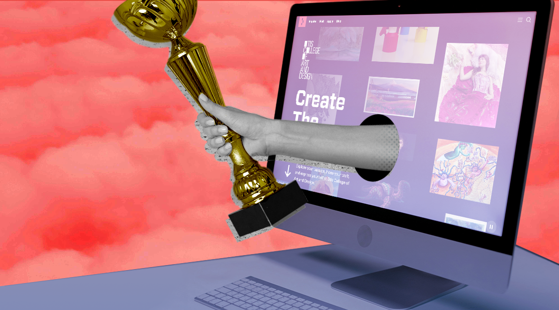
Otis College of Art & Design
Website: https://www.otis.edu
Bold and modern, the Los Angeles art school’s 2024 redesign features a visually stunning and immersive look that is effective at showcasing student artwork and career readiness. Navigation is tailored by audience—with filters by degree, interest, and goal—along with impactful displays of statistics that showcase the career successes of Otis alums. Eschewing a single hero image on the homepage, users can click around an array of interactive images of student creations, each revealing a deep dive into the personal stories behind the creative process. Plus, a nifty card-style stack of artwork invites shuffling and exploration, echoing the interactive nature of the overall design.

Pratt Institute
Website: https://www.pratt.edu/
As you might expect from a leading art and design university, Pratt Institute’s website delivers a sleek, contemporary experience that goes big with visuals (the homepage is scaffolded almost entirely with video). The imagery transports you to Pratt’s urban New York City campuses, while interior pages harness rich storytelling through longform features from Prattfolio, the university’s magazine (dive in and you’ll wish you were a student in Pratt’s Stand Up Comedy for Writers course). Beyond all the artistry, the site’s content is well-organized and easy to navigate, blending creativity and functionality.

Purdue University
Website: https://www.purdue.edu/
Purdue’s homepage boldly proclaims, “Every Giant Leap Starts with One Small Step,” a tribute to one of its more famous graduates, the astronaut Neil Armstrong. The messaging, unveiled in a 2020 rebrand around “The Next Giant Leap”, taps into Purdue’s legacy of interstellar pioneers who followed in Armstrong’s footsteps. Wide-screen immersive photos of the campus include clickable Easter eggs that give you an introduction the campus, its history, and landmarks. A clean palette of white, black, and gold reinforces Purdue’s brand identity, while storytelling—through news, alumni success stories, and video—underscores its reputation as a hub of innovation and exploration.

Rhode Island School of Design (RISD)
Website: https://www.risd.edu/
Rhode Island School of Design’s electric “RISD Blue” and modern typography pop against a clean white background. The site balances a minimal approach with flights of fancy. As you scroll the homepage, static and animated art pieces reveal themselves, telegraphing that this is a cutting-edge environment for creative minds, while documentary-style videos personalize the student experience, adding a human touch. Statements like “We generate and challenge the ideas that shape our future” are effective at evoking RISD’s philosophy as an institution that “cultivat[es] expansive and elastic thinking.” The main menu neatly segments users by category, ensuring clear navigation and quick access to the content they need. Overall, the website is an artful showcase for one of the world’s top design schools.

Texas Tech
Website: https://www.ttu.edu/
They say “everything is bigger in Texas,” and that also includes the bold sans-serif type on Texas Tech’s website. The site’s striking red-and-black palette and dynamic photography amplify the energy. User-based navigation is big, clear, and intuitive, with a live chat feature for direct engagement. And its “Texas Tech Now” section is a robust and media-rich hub for uplifting stories featuring photos, audio, and video. Adding even more verve is a gallery of student-generated Instagram posts tagged @TexasTech. It’s a vibrant, community-driven digital experience that brings together academic achievement and school spirit. Go Red Raiders!

Washington University in St. Louis
Website: https://washu.edu/
Washington University in St. Louis’s crisp homepage features a fast-loading animated collage of photos and typography that asks, “Can collaboration change the world?” The site responds with a dynamic mix of video and text under the banner “This is what WashU can do,” highlighting breakthroughs WashU—everything from WAshU students disrupting the breakfast industry to engineers building sustainable plastics. Navigation is seamless, with a “For You” dropdown that curates content for prospective students, parents, alumni, and more—making the site as thoughtfully organized as it is visually engaging.